A Good New Look
What’s in a name? What would be your icon that represents the fabric of your person?
Discovering our branding was a journey for us at Good Goods. The end product was better than what was originally imagined, but it became obvious that hiring a professional was what we needed. We worked tirelessly with Christina Sicoli, a local designer (or should we say, she worked tirelessly with us!) to really hone in on what we were trying to capture. After much deliberation, we feel we have found the perfect statement to represent both us and our community.

Everything about our brand has meaning. Originally, we thought that the process would start with a logo. We were surprised and excited to discover that instead, Christina challenged us to look outside of what we were comfortable with and stretched us to explore possibilities. Focussing on the experience of the brand, we pulled together complementing details into a captivating direction. Each piece was tailored to represent the collective of vendors and their exceptional goods that make up Good Goods Company.
![]()
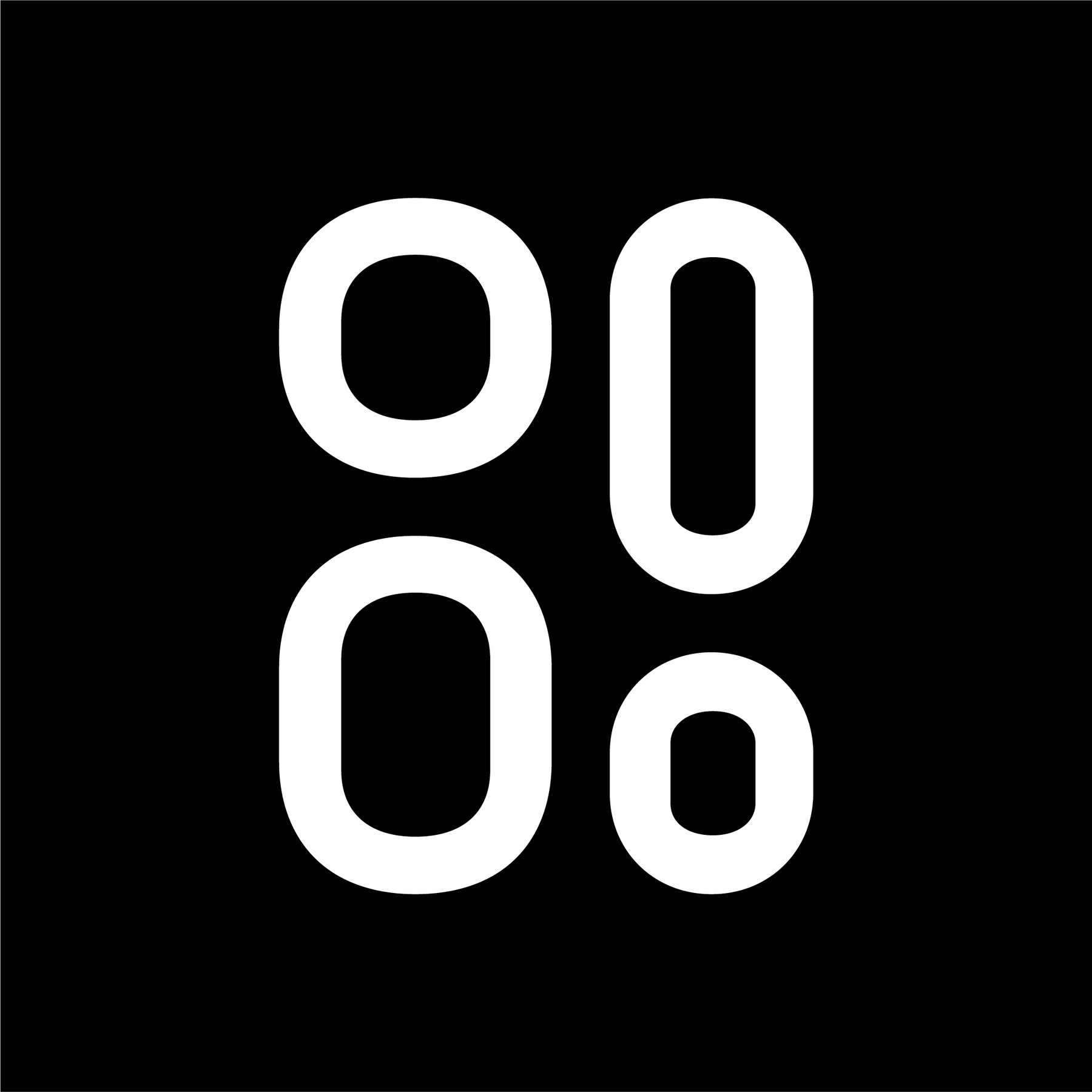
The brand typography is a collection of different sizes and shapes, which represent the community of small businesses we work with. Without this community and their exceptional products, Good Goods simply could not exist. Each letter is symbolic and needs the other.
We feel that we’ve taken a bold approach, speaking to the strength that comes from our community. By building a strong and supportive platform, Good Goods brings people together and unites them through a shared experience.
A playful, yet sophisticated brand that speaks to our constant discovery of new businesses yet does not overshadow the products we hope to represent. We encourage shoppers to join us in the discovery of local goods.
As you open your first or hundredth box, we look forward to the excitement that good goods brings.
SHOP GOOD

